Fancy text
𝔉𝔞𝔫𝔠𝔶 Unicode styles on one keyboard: pick a style from the strip, and what you see on the keys is what you type.
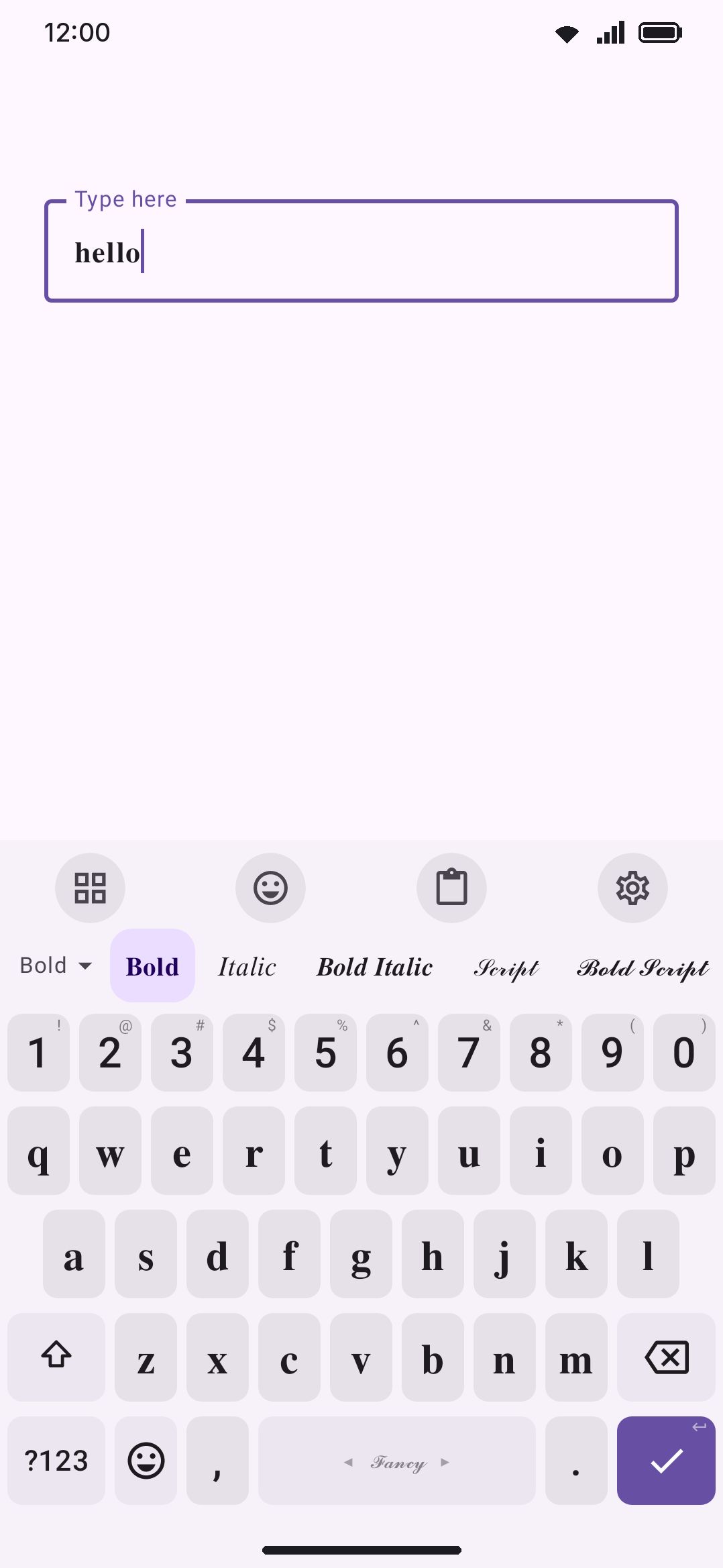
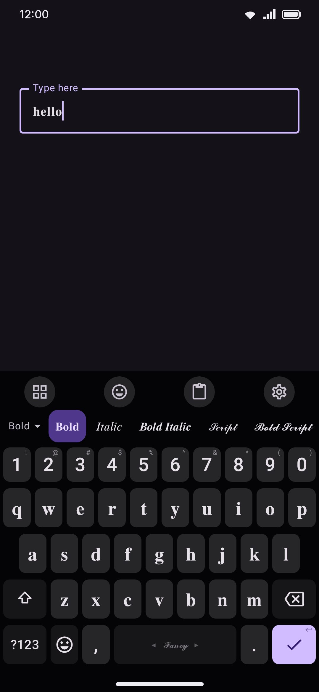
Fancy Text isn’t a language. It’s 50 Unicode “font” styles on a single keyboard, plus zalgo at levels you pick, a Normal style that types plain letters, and any fonts you make yourself. Add it once, pick a style from the strip above the keys, and every letter key immediately shows the styled glyph (zalgo styles keep plain letters on the keys). What you type is already 𝓯𝓪𝓷𝓬𝔂: there’s no separate conversion step afterward, and the suggestion strip and autocorrect work on the plain letters underneath.
Turning it on
Section titled “Turning it on”Fancy Text lives in the same language catalogue as everything else, and Languages overview covers how that catalogue works in general. Search for “fancy” (or scroll to ”𝓕𝓪𝓷𝓬𝔂 · Fancy Text”) and tap the row. That’s the whole setup: one entry in your language list, one layout, one stop on the 🌐 cycle and the OS keyboard switcher.
The Fancy text tool
Section titled “The Fancy text tool”If you only want fancy letters now and then, the Fancy text toolbar tool does the same thing in one press, from the keyboard, without a trip to Settings. Pin it from WM Keyboard Tools (it’s in the Quick actions group) or find it in the toolbox. Press it and the fancy keyboard appears, adding Fancy Text to your language list if it wasn’t there already. Press it again and you’re back on the layout you came from, with Fancy Text taken out of the 🌐 cycle again so it isn’t in the way of the languages you actually read. The tool’s icon stays lit for as long as the fancy keyboard is the one typing, however you got there.
Its own screen, at WM Keyboard Tools Fancy text, has three settings:
- Style to start with. Pin one style and the tool always turns on in it. Left on “Last used”, it starts from whatever style you picked last. Either way the strip over the keys still switches styles for the rest of the session, and a pinned style is never overwritten by it.
- Keep the language after you turn it off. On, Fancy Text stays in your language list once the tool has added it, so a spacebar swipe reaches it too. Off (the default) takes it back out again.
- Turn off when the keyboard closes. On by default. For one nickname or one message: leave the field and the keyboard comes back typing plainly. It only undoes what the tool itself turned on, so a Fancy Text language you added in Settings stays put.
On a hardware keyboard the tool answers to the leader key followed by F; see Hardware keyboards.
The same switch also lives in Settings as the Fancy text toggle on WM Keyboard Rows & bars, next to the row order, where the style strip can be dragged above or below the other rows.
Picking a style
Section titled “Picking a style”While the fancy keyboard is active, a strip appears above the keys with every style written in itself: Normal, 𝐁𝐨𝐥𝐝, 𝘐𝘵𝘢𝘭𝘪𝘤, 𝔉𝔯𝔞𝔨𝔱𝔲𝔯, 🅒🅘🅡🅒🅛🅔🅓 and so on. Tap a chip and the keys restyle instantly. Normal, first in the strip, puts the plain letters back without leaving the fancy keyboard. The strip sits nearest the keys by default; WM Keyboard Rows & bars Row order moves it above the other rows. The pick is remembered until you change it, and Styles on the strip decides which styles the strip offers and in what order. The dropdown on the strip’s left edge names the current style. Open it and every style appears written in itself, exactly like the chips above; a screen reader still gets the plain name for each one.
The same choice also lives in Settings, on the Fancy Text language screen, as a Style row.
The full set, with the name each one shows:
| Style | Style | Style |
|---|---|---|
| Bold | Sans-serif | Circled |
| Italic | Sans Bold | Circled (Filled) |
| Bold Italic | Sans Italic | Squared |
| Script | Sans Bold Italic | Squared (Filled) |
| Bold Script | Monospace | Small Caps |
| Fraktur | Fullwidth | Superscript |
| Bold Fraktur | Double-struck | Strikethrough |
| Underline | Regional Indicator | Parenthesized |
| Double Underline | Overline | Slashthrough |
| Wavy Underline | Dotted | Upside Down |
| Currency | Bypass | Subscript |
| Mirror | Faux Cyrillic | Faux Greek |
| Syllabics | Thai Look | Kanji Look |
| Ethiopic Look | Bracketed | Lenticular |
| Tilde Strike | Cross Above | Seagull Below |
| Arrow Below | Boxed | Ringed |
| Glitch | Vaporwave |
After them come the zalgo styles, Zalgo 3 and Zalgo 7 unless you change them.
WM Keyboard Languages & layouts Fancy Text ZalgoZalgo piles random combining marks above, below and through every letter and digit, so text looks like it’s melting. How much is up to you: every zalgo style has a level from 1, a mark or two on each side of a letter, to 10, a tower of them, with strokes through the letters from level 4 up. Two come with the app, Zalgo 3 and Zalgo 7.
Tap Add a zalgo level to make another. The dialog shows “He comes 666” at the level you’re on and redraws it as you drag the slider. A name is optional; left empty, the style is named after its level. Each zalgo style is its own chip on the strip, so a light one and a heavy one can sit side by side. Tap a row to change its level or name, or swipe it away to delete it. You can keep up to 10. Deleting the one you’re typing in sends the keyboard back to Bold.
The marks are drawn at random, but not on every keystroke. A letter’s marks depend on the letter, its place in the word and a number picked when the keyboard starts. The word you’re typing keeps its marks as it grows instead of reshuffling under your fingers, and the same word comes out differently after the keyboard restarts. Zalgo composes like the other styles, with suggestions and autocorrect on the plain word underneath. The keys are the one place zalgo stays away: they show plain letters while a zalgo style is on, since its marks would pile over the neighbouring keys until none could be read.
Only marks that no Latin-script language writes with are used: never an acute, a grave, a cedilla, a caron or the like. That keeps every mark safe to strip back off when the keyboard reads the field, and none of them merges with a letter when an app normalises its text. Glitch, in the main table, is a fixed version: the same two or three marks on a letter every time.
Choosing which styles show
Section titled “Choosing which styles show”With fifty-odd styles, the strip is long. This group, folded until you open it, lists every style written in itself. Drag one by its handle to move it along the strip, and switch it off to take it off the strip. Its heading counts how many are shown. Reset the strip brings back every style in the order they ship.
The same order and choice apply to the strip’s dropdown, the Fancy conversions in the selection actions and the fancy row of the suggestion pages. A style you switch off isn’t gone. The Fancy style row and the Fancy text tool’s Style to start with still list every style, so it can be picked on purpose, and the style you’re typing in always stays on the strip, switched off or not. Styles added in a later release, zalgo levels you add and fonts you make join at the end, switched on. Switching every style off shows them all again rather than leaving the strip empty.
Your own fonts
Section titled “Your own fonts”When the style you want isn’t in the list, make it. Fancy-text websites build many of their “fonts” out of look-alike symbols (ᗩᗷᑕ, ค๒ς, Λߢ), and any of them can become a style here. Tap Add a font, give it a name, and paste the font’s letters:
- Small letters, a to z. Required. Paste the 26 letters in order. If you paste a to z, A to Z and 0 to 9 in one go (62 characters, or 52 without digits), the keyboard shares them out over the three fields for you.
- Capitals, A to Z. Optional. Left empty, shift types the small letters, the way Small Caps does.
- Digits, 0 to 9. Optional. Left empty, digits stay plain.
Each field counts what it read, so you can see straight away if a letter went missing. An alphabet that stops short is fine: the letters it doesn’t reach type plain. Characters are counted the way you see them, so a letter with a stroke or an accent stacked on it counts once. To give one letter several characters, such as (a) or 【a】, separate the letters with spaces and each item counts as one letter.
Write backwards is for upside-down fonts. It reverses the line so the text reads correctly with the phone turned round, and like the built-in Upside Down style it types letter by letter, without suggestions.
A preview at the top of the form writes a pangram in the font as you go. Once saved, the font appears at the end of the strip over the keys, in the Style row, and in the selection actions’ Fancy conversions, and the keyboard switches to it. Tap a font in the list to change it, or swipe it away to delete it. If the font you delete is the one in use, the keyboard goes back to Bold. You can keep up to 50 fonts. They’re part of your settings, so a settings backup carries them to a new phone.
The keyboard itself
Section titled “The keyboard itself”The fancy layout is a plain QWERTY grid: three letter rows plus a bottom row for ?123, comma, 🌐, space, period, and Enter. Comma, period, space and the other symbols always commit as plain ASCII, because only letters and digits get the styled substitution. There are no long-press popups on the letter keys. Digits come from the shared ?123 panel, or the number row if you have it on.
Numbers
Section titled “Numbers”Digits are styled too, wherever Unicode has digits for the style: Bold types 𝟏𝟐𝟑, Double-struck 𝟙𝟚𝟛, Sans-serif 𝟣𝟤𝟥, Sans Bold 𝟭𝟮𝟯, Monospace 𝟷𝟸𝟹, Fullwidth 123, Circled ①②③, Circled (Filled) ❶❷❸, Superscript ¹²³ and Parenthesized ⑴⑵⑶. The digit keys show the styled form, like the letters.
Unicode has no italic, script or fraktur digits. The bold variants of those (Bold Italic, Bold Script, Bold Fraktur) borrow the bold digits, and Sans Italic and Sans Bold Italic borrow the sans ones, so a word and the number next to it keep the same weight. Italic, Script, Fraktur and every other style type plain digits. Parenthesized has no zero, so 0 stays plain there.
Hold any digit key, on the symbols panel or the number row, for every styled form of that digit in one popup, whatever style is active: bold, double-struck, sans-serif, sans bold, monospace, fullwidth, circled, negative circled (❶), sans-serif circled (➀), parenthesized (⑴), with a full stop (⒈), superscript (¹), subscript (₁) and segmented LCD digits (🯱). The last few belong to no style, so the popup is the only way to type them. The key’s usual alternates stay first, so a plain hold still does what it always did. Segmented digits are from Unicode 13, and older fonts show them as empty boxes.
Hover or tap a key with a corner hint to see all its long-press characters.
How it works
Section titled “How it works”The layout stores plain letters, and the selected style substitutes each one at the last moment, both on the key labels and in what goes into the field. The keyboard itself keeps working with the plain word: that’s what it suggests from, corrects and learns, and the style is applied to the word being typed and to everything committed into the field. Shift works exactly like any other layout: it uppercases the plain letter, and the style supplies its capital form where one exists. Two different Unicode techniques produce the styling, depending on the style:
- Precomposed characters, mostly from the Mathematical Alphanumeric Symbols block, for Bold, Italic, Script, Fraktur, Double-struck, Sans, and Monospace (and their combinations). These sit outside the Basic Multilingual Plane, so they need a font with supplementary-plane coverage to render. See the gaps below.
- Combining marks stacked on plain ASCII letters, for Strikethrough (a stroke mark after each letter) and Underline (a low-line mark after each letter). These stay inside the BMP, so they render reliably almost everywhere, at the cost of being two codepoints per letter instead of one.
Circled, Squared, Fullwidth, Small Caps, and Superscript draw from a few other existing Unicode blocks. Circled (non-filled) is Enclosed Alphanumerics, Fullwidth is the Fullwidth Forms, and Small Caps and Superscript come from the phonetic and modifier-letter ranges, all of which are inside the BMP. Squared, Squared (Filled), and Circled (Filled) are the exception in that group: they sit in the Enclosed Alphanumeric Supplement, which is outside the BMP like the mathematical styles. No font ships with the app for any of this: rendering depends entirely on whatever font the app or system you’re typing into already has installed, which is where the gaps below come from.
Not every style has full alphabet coverage. Italic, Script, non-bold Fraktur, and Double-struck hit codepoints the Mathematical Alphanumeric block deliberately leaves empty, so those specific letters fall back to older, BMP-only symbols instead. Superscript goes further: Unicode has no capital superscript letters at all, and no superscript “q” in any case, so shift changes nothing there and “q” types a plain lowercase q.
Details & edge cases
Section titled “Details & edge cases”Case coverage varies by style. Superscript and Small Caps have no capitals, so shift leaves them as they are. Unicode doesn’t define capital forms for them. Squared, Squared (Filled), and Circled (Filled) are single-case too, since Unicode only assigned capital-shaped symbols for those blocks. Currency is single-case as well: it borrows currency signs and other symbols that look like the letters (₳ ฿ ₵ ₫), and leaves out letters a language writes with, such as ł and Ø, so a Polish or Danish word read back from the field is never mistaken for styled text. Circled (non-filled), Fullwidth, Double-struck, and every Fraktur/Script variant do have real upper/lower distinction.
A handful of letters fall back to an older block. Double-struck is missing astral capitals for C, H, N, P, Q, R, and Z, and non-bold Fraktur for C, H, I, R, and Z, so both fall back to the Letterlike Symbols block for those. Non-bold Script is missing letters in both cases: e, g, o in lowercase and B, E, F, H, I, L, M, R in capitals. Italic has exactly one gap, the lowercase h. Bold Fraktur, Bold Italic, and Bold Script have no such gaps, since their Unicode blocks are complete. Small Caps has gaps of its own kind: Unicode never encoded a small-capital X, so “x” types a plain lowercase x, and “q” types ǫ, because the small capital Q Unicode added later is missing from most phone fonts and would show as a blank.
Suggestions, autocorrect and swipe typing use English. Fancy Text has no word list of its own (the language screen’s Dictionaries section has no word list row, only Custom dictionaries), so it borrows the English one. You type plain letters, and the strip suggests and corrects them as it would on an English layout. The word being typed already shows in the style, underlined like any word in progress. A space, a punctuation mark, a pick from the strip, an autocorrection and a swipe all go into the field styled, and a backspace straight after an autocorrection still puts back what you typed. The keyboard learns the plain spelling of what you type, never a styled word.
Tap a different style while a word is being typed and that word switches style with it. Moving the caret back into a styled word doesn’t pick it up for editing the way it does on other layouts: the field holds styled glyphs, and the keyboard only edits words it can read as plain letters.
Upside Down and Mirror type letter by letter. Their glyphs only read correctly once the whole line is reversed (a mirrored line reads right to left), so they keep substituting each key as you press it, with no suggestions or autocorrect. Letters that look the same in a mirror stay plain in Mirror.
Subscript is mostly lowercase and partly plain. Unicode has subscript forms for only 17 letters (a e h i j k l m n o p r s t u v x), so b, c, d, f, g, q, w, y and z type plain, and capitals type the small forms. All ten digits have subscripts.
The look-alike styles borrow other alphabets. Faux Cyrillic, Faux Greek, Syllabics, Thai Look, Kanji Look and Ethiopic Look are built from real letters of other scripts that resemble Latin ones, the way fancy-text websites do it: Д for A, ᗩ for A, 卂 for A. A screen reader reads them as those scripts’ letters. Faux Cyrillic has capitals of its own; the others are single-case, with a few plain letters where nothing looks close enough. Currency avoids letters other languages write with; these can’t, and needn’t, because the keyboard only reads styled text back to plain letters while the fancy keyboard is the one typing.
Bracketed, Lenticular, Boxed and Ringed wrap digits too. Bracketed writes 【a】, Lenticular 『a』, Boxed draws a square around each letter and Ringed a circle. Boxed and Ringed use enclosing marks that some fonts draw off-centre or not at all.
Vaporwave spaces the letters out. It types fullwidth letters with a narrow four-per-em space between each pair, for the a e s t h e t i c look. Your own spaces stay normal ones, and the keyboard takes the narrow spaces back out when it reads the word.
Everything the keyboard puts in the field is styled. Besides typing, that covers text pasted from the clipboard panel, dictation and snippet expansions while the fancy keyboard is active. Emoji and punctuation have no styled forms and go in unchanged. The selection actions’ own conversions are the exception: a Fancy or colour conversion of selected text goes in exactly as the action wrote it.
The keyboard’s own search boxes get plain letters. Typing into the emoji search, GIF search, or any other panel search while the fancy keyboard is active types unstyled letters, so those searches actually match. Only text committed to the app’s field is styled.
Search and screen readers in the receiving app are governed by that app, not by WM Keyboard. Styled Unicode letters aren’t the same codepoints as their plain equivalents, so a search box or screen reader that only matches literal ASCII text won’t recognize 𝕥𝕙𝕚𝕤 as “this.” That’s general behavior of the receiving app, not something this keyboard controls either way.
The base grid is an ordinary layout, so you can open it in the visual layout editor to remap a key or add long-press entries. See Custom layouts & the layout editor. The styles themselves aren’t separate layouts anymore, so they can’t be edited individually: your remapped keys apply to every style.